Project 17 Cup 2024
Design approach & execution
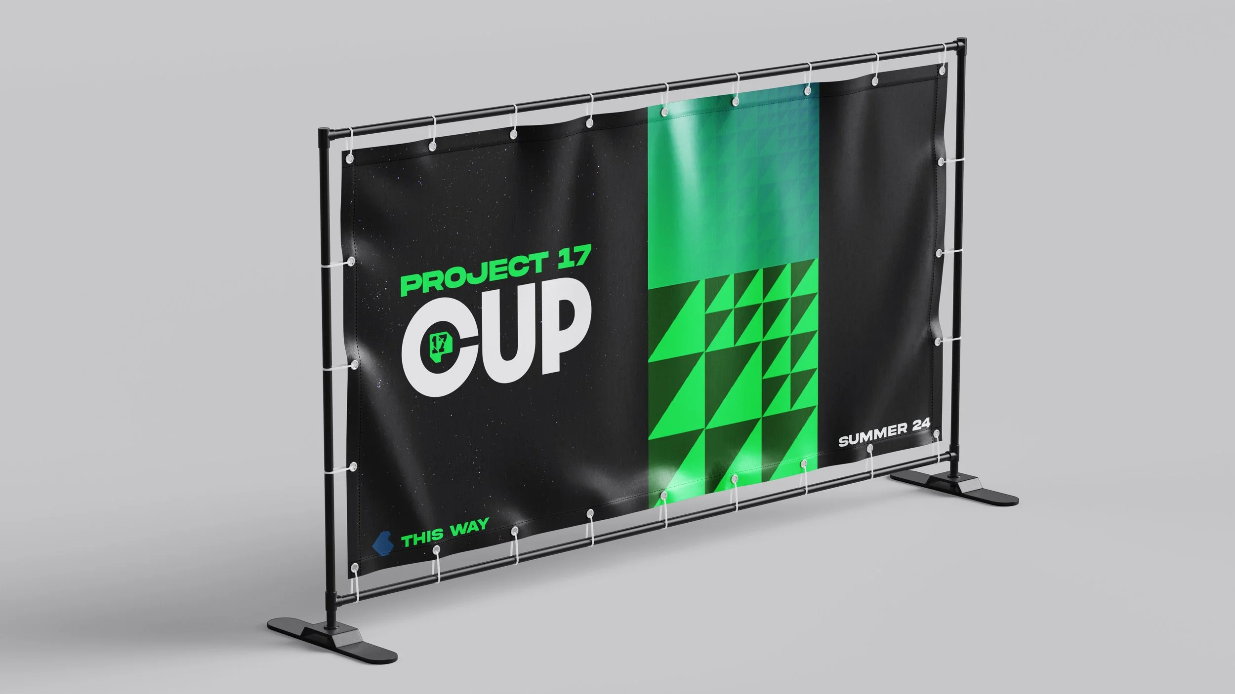
I developed a campaign identity centred on:
A flexible grid that could be scaled from posters and signage to social layouts
High-impact typography to maintain clarity and energy in busy environments
Photography-led layouts celebrating real moments of play, motion, and community engagement
A vibrant colour palette chosen for accessibility and presence, enhancing recognition across both physical and digital touchpoints
The system was applied consistently across event signage, participant materials, social content, and printed collateral — creating a cohesive and recognisable presence throughout the Cup experience.
Outcome
The Project 17 Cup identity delivered a confident, energetic visual language that strengthened community participation and visibility. The system balanced bold expression with functional clarity, helping establish a campaign presence that felt both authentic and elevated. This project demonstrates an ability to translate cultural insight into coherent brand systems that resonate with diverse, real-world audiences.
the challenge
Project 17 Cup looked to unify and energise a grassroots sports community through a celebratory visual identity that could function across print, digital, and event environments. The brief required a flexible system that could feel vibrant and expressive without overwhelming the authentic energy of the participants themselves.
insight
Community sport thrives on visibility and pride — participants want to feel seen and represented. An identity that amplifies real moments, real movement, and real personality would strengthen the emotional connection to the event and elevate its presence across physical and social environments.
creative direction
The visual language was designed to amplify human energy through bold typographic expressions, dynamic compositions, and a modular graphic system capable of adapting across formats. The system placed movement and participation at its core, prioritising a sense of collective momentum rather than static polish.